PANTONE 11-4201 Cloud Dancer Sparks Debate
This year’s pick for the Pantone Color Institute Color of the Year leaves some baffled, while others see the understated elegance and calming effect of the shade of white
.webp?t=1768225982&width=1080)
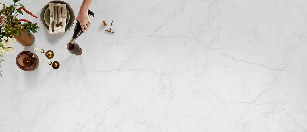
Dover White quartzite from Antolini
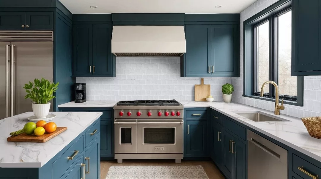
Calacatta Miraggio Lusso from the Q Studio™ Collection by MSI
MSI's Zest Star Collection captures the inviting warmth and organic handcrafted character of traditional tile, reimagined for modern living.
For the past 27 years, the Pantone Color Institute has selected a Color of the Year to spark inspiration and creative design. The educational program was launched in 1999 by the Pantone Color Institute with the intention of engaging the design community and color enthusiasts around the world in a conversation about color. Its pick for 2026 is PANTONE 11-4201 Cloud Dancer, a billowy white imbued with a feeling of serenity.
The Pantone Color Institute describes PANTONE 11-4201 Cloud Dancer as “an ethereal white hue which serves as a symbol of calming influence in a frenetic society rediscovering the value of measured consideration and quiet reflection. A breath of color whose vaporized and aerated presence gently illuminates and enlightens, PANTONE 11-4201 Cloud Dancer is a whisper of calm in a noisy world.”
“At this time of transformation, when we are reimagining our future and our place in the world, PANTONE 11-4201 Cloud Dancer is a discrete white hue offering a promise of clarity,” stated Leatrice Eiseman, executive director of the Pantone Color Institute. “The cacophony that surrounds us had become overwhelming, making it harder to hear the voices of our inner selves. A conscious statement of simplification, Cloud Dancer enhances our focus, providing release from the distraction of external influences.”
And as the intention for the program, Cloud Dancer is creating conversation among the design community. While some are perplexed about the choice, others understand after giving it some consideration.
Left with Questions
“This year’s choice for Color of the Year is the embodiment of pure dichotomy,” said Ryan Fasan, co-founder of Crest Craftsmen, Ltd. in Vancouver, British Columbia, Canada, and technical consultant for Tile of Spain USA. “Perhaps Pantone’s goal, like most marketing slants or even political campaigns of this decade, is to create a salaciously polarizing topic and let it hang out there so a huge buzz of both positive and negative follows in its wake. While there are a lot of positive reasons to have selected a white for the color-of-the-year – the flag or dove of peace – it’s also associated with the Klan, colonialism and a lot of less than savory things. It's a strange choice for Pantone given the past two Color of the Year [choices, Mocha Mousse and Peach Fuzz,] were, in my eyes, at least skin tones. While I understand the published reasoning given for selecting Cloud Dancer White; it does seem glaringly tone-deaf for an event that’s supposed to capture the zeitgeist of the moment and inspire the narrative for the year’s creative endeavors.
“I’m also surprised that it’s such a neutral white given the proliferation of warm tones for neutral field colors which are being paired with cool accents of blues and greens,” Fasan went on to say. “Cloud Dancer is pure mid-spectrum, perhaps erring towards gray, if anything. From its position in color-space to its place in culture and connotations, this year’s Color of the Year choice leaves me with more questions than answers. Perhaps that was the goal.”
Allows Hard Surfaces to Speak
"Cloud Dancer is a soft warm white, subtle cream and ivory undertones,” said Colleen Bennett of CBB Design Firm in Morganton, NC. “Naturally warm with beige and soft yellow tones, it has a slightly lowered blue value which it throws off as it removes the starkness and prevents the cool gray feel. So, it is both warm, but it has a blue hue, which is going to be very hard to match with things. It is very hard to match because it’s a gray-based under-toned white. It prevents a stark feel, but it still has a very cool gray feel. This was probably chosen because we are in such chaos.”
Bennett went on to share her thoughts on how she believes the color will pair with hard surface materials. “When you're looking at materials -- natural stone, tile, quartz or sintered stone -- that slightly lowered blue value is going to impact things,” she said. “Using this with a stone typically allows for the stone to speak. You can pick some moodier ones. If you want something bold, you can do it as that will be the statement piece. It allows those materials to speak because it is a more boring color."
A Modern Canvas
“Tracking color is always top of mind at MSI,” said Emily Holle, MSI director of trend & design. “We continuously analyze insights from paint brands, global color forecasters and emerging design movements, and translate that intelligence into forward-looking product direction. While a white selection initially felt unexpected, it quickly aligned with what we’re seeing across the market. White continues to lead across surfaces -- from tile and countertops to stacked stone -- evolving rather than disappearing. Today’s whites are warmer, softer and more nuanced, reflecting a shift toward calm, longevity and quiet luxury. As a foundational color, white acts as a modern canvas -- timeless yet adaptable -- resonating across residential and commercial spaces nationwide, from coastal California to urban New York and sun-washed Miami.”
Holle went on to share insight about an array of materials embrace the hues of Cloud Dancer. “Immerse your space in refined luxury with the show-stopping elegance of Calacatta Miraggio Lusso from the Q Studio™ Collection,” she said. “This exquisite USA-made quartz showcases a breathtaking interplay of pewter, soft white and layered gray veining that drifts effortlessly across a luminous, Carrara-inspired backdrop. Evoking the airy sophistication of Cloud Dancer, this striking surface delivers a timeless canvas for elevated design, bringing depth, movement and undeniable beauty to any space.
“Zest Star captures the inviting warmth and organic handcrafted character of traditional tile, reimagined for modern living,” Holle continued. “Its soft luminous off-white surface -- layered with delicate pastel undertones inspired by authentic Moroccan Zellige -- reflects light beautifully, creating an atmosphere that feels fresh, airy and effortlessly clean. As a leading design trend, this nuanced white offers a timeless yet contemporary foundation, brightening surrounding elements while adding subtle depth and movement. The result is a serene versatile surface that elevates everyday spaces with understated elegance and artisanal charm.”
Looking for a reprint of this article?
From high-res PDFs to custom plaques, order your copy today!


