Tile Trends
Color Palettes and Surface Finishes
Designers from leading tile manufacturers discuss trending colors and finishes, and some of the places that inspire and influence these new product trends
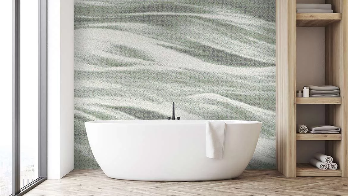
When considering a new color palette, the Artaic design team’s primary consideration is versatility -- being able to appeal to designers no matter what project they are working on. (Shown: Cascade in Sage). Photo courtesy of Artaic
Each year, certain colorways emerge as a popular choice when designers and homeowners alike are selecting tile for their projects. Most recently, jewel tones such as emerald green and sapphire blue have a strong presence, and warmer shades are also making a comeback. Moreover, textured tile continues to be prevalent. Evolving technology allows for an increased selection of surface finishes. TILE recently caught up with Kait Paradowski, design director at Artaic, and Jill Cohen, vice president of design at Artistic Tile, to ask them to share their thoughts and experiences on the inspiration behind developing new color palettes and tile collections, as well as the current trends they are seeing.
TILE: When designing a new color palette or collection where do you seek inspiration?
KP: Each quarter, we have inspiration days for the team. We visit local exhibitions, parks and simply get out of the office to connect. Our design team also meets to discuss the different trends we are seeing across industries – whether it is garnering traction on social media or making statements in fashion, it is all intertwined.
JC: When designing a new collection, we seek inspiration from various sources such as art, travel, nature and international design.
Artaic holds inspiration days for its design team several times throughout the year for them to be outside to connect and observe the various trends. (Shown: Manor in Coastal). | Photo courtesy of Artaic
TILE: What considerations are there before finalizing a new color palette or surface finish?
KP: Our Custom-on-Demand colorways are stocked in-house in Boston, MA. We approached these colorways with the idea that they would be applicable to all design industry sectors. They could be used in a residential bathroom, but also can easily work in a commercial lobby. The main factor was versatility; being able to appeal to designers no matter what project they are working on. This gives all designers the chance to specify thoughtful colorway options at an expedited lead-time.
JC: Before finalizing a new collection, we consider several factors regarding color and finish. One important consideration is the ongoing supply of materials, as they all come from nature. Additionally, we strive for consistency and the desired feel of the surface we aim to achieve.
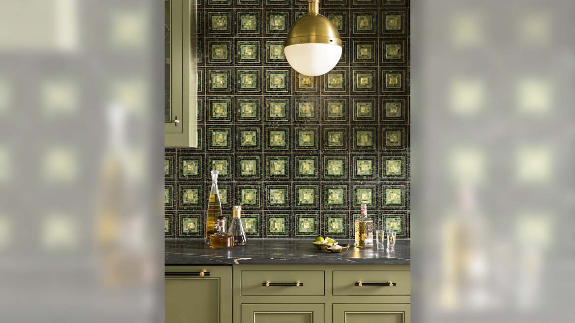
Jewel tones in green and blue are a popular choice in today’s designs. (Shown: Hip 2B Square). | Photo courtesy of Artistic Tile
TILE: What do you find are influences in regards to trending colors each year?
KP: Industry trade shows, fashion and runway, social media, art exhibits -- our design team is made up of designers from different disciplines and backgrounds, including interior design, architecture and illustration. We like to stay curious and pull color and design inspiration from many different channels, which helps us give a well-rounded and thoughtful approach.
JC: Influences regarding trending colors each year can vary. Sometimes it is a matter of contrast, such as warm versus cool or dark versus light. We also take into account materials that have been reintroduced or have not been seen in the market for a long time. Luxury fashion often serves as an inspiration for color choices.
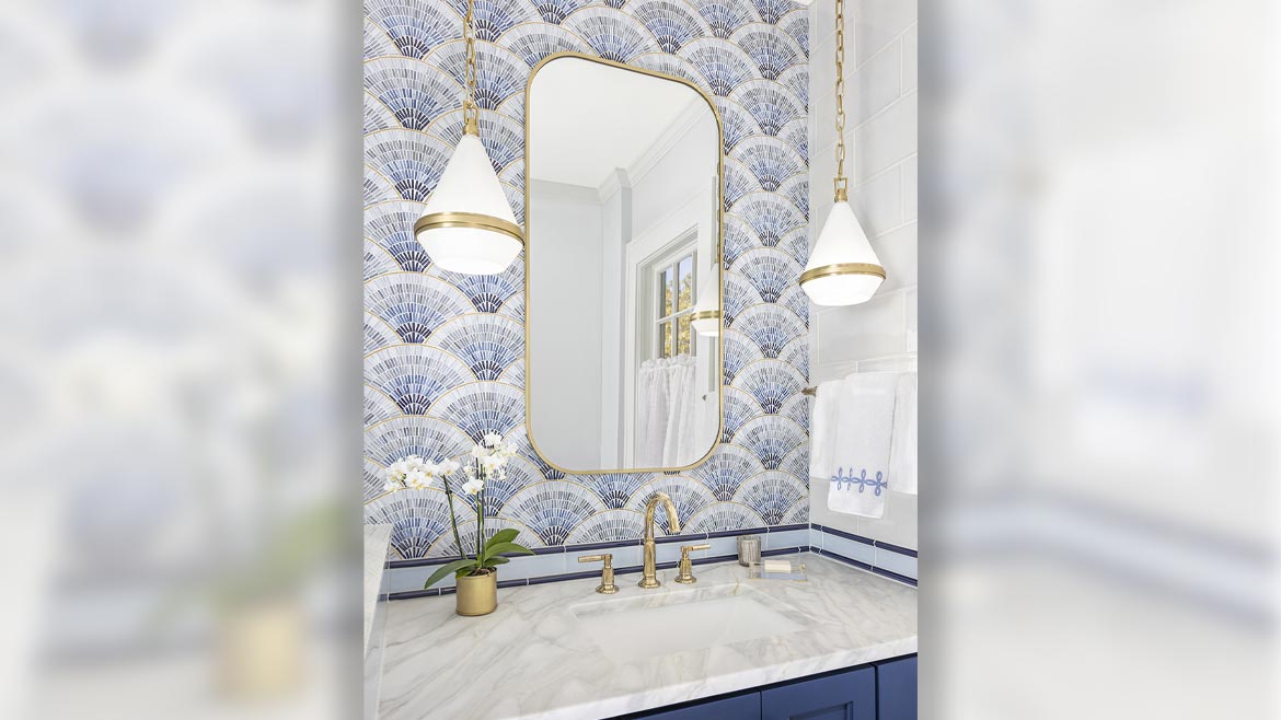
“When designing a new collection, we seek inspiration from various sources such as art, travel, nature and international design,” said Jill Cohen, vice president of design at Artistic Tile. (Shown: Fan Club Blue Ombre). | Photo courtesy of Artistic Tile
TILE: How many shades are usually in one color palette?
KP: We create a range anywhere from six to 18 colors in each palette. When crafting a custom mosaic for a client, the color count gets higher the more detailed the artwork, so we try to offer variety in our palettes to inspire the designs.
TILE: What colors do you find popular this year?
KP: We’re seeing a lot of complex neutrals, incorporating sophisticated greens used as a “new neutral.” We are also seeing a resurgence of bright, joyful, saturated colors.
JC: We are seeing more warm tones in the market, but we still love blue and green.
TILE: Is there anything else you would like to add?
JC: Color and finish, like all of design, are subjective and are meant to evoke feeling. There is no definitive procedure to determine what is “in” or “out.” Our priority is always to find the most beautiful materials, finishes and patterns, with the understanding that color should enhance the overall experience.
Looking for a reprint of this article?
From high-res PDFs to custom plaques, order your copy today!


