The modern art of mosaics
Mosaics have been an important part of decorative design for centuries. When they were first made, the designs were often a depiction of an animal or event. Though they were not simple designs, they were typically done with one or two different natural stones and a small variation of color.
As the years progressed, so did the art of mosaics. More color was introduced, and different stones appeared in the designs. In today's design, color variations and palettes are used in mosaics -- from mild earth tones to bright, bold colors. The use of one material has also given way to combinations of materials.
"The two big words when it comes to mosaics now are 'texture' and 'movement,' " said Anna Marie Fanelli, designer at Floor & D?r in Tenafly, NJ. "The combination of using glass with [natural] stone, metal with stone or inexpensive porcelain with stone provides texture. The combinations create a whole different feeling -- there is a passion to the room now."
Since the advent of mosaics as an art form, they are used to distinguish any environment, from a large mosaic hanging on the wall in a commercial application to mosaic tile in the foyer of a residence.
Also used in kitchens and bathrooms -- where functionality is as important as aesthetics -- the designs of mosaic tile have become more creative, according to Fanelli. "The trend in the mosaic industry as I see it, is that it has become very fashion-oriented," said Fanelli. "Our showroom is no longer a place where a person comes in to look at material, it has become more of an art gallery."
Personalizing with mosaics
Fanelli recently put combinations of different materials and sizes to create texture in one residence in Bergen County, NJ. In designing the bathrooms in the home, each one had to be personalized to its user, while complementing the room adjacent to it.The playroom had been done in a leopard motif, so the playroom bath had to fit the feeling of that room. "The motif of the bathroom had to be deep and colorful," said Fanelli. "It had to be reflective of the wild range in the playroom - we needed something as wild as leopard."
To get this effect, she used a wide range of materials. Tumbled peach travertine was used in many different sizes to create a textural bath. Travertine in 3- x 6-inch tiles was used for the shower walls, surrounded by a tumbled mosaic band. The band was then wrapped with 5/8- x 3/8-inch mosaics and 4- x 4-inch tiles of the material, then capped with a chair rail. The floor was done with three sizes of tumbled peach travertine tiles -- 8- x 8-inch, 4- x-4 inch, and 1- x 1-inch tumbled marble -- which created a patterned floor. There was 60 linear feet of band mosaic, 50 square feet of 8- x 8-inch tiles and 20 square feet of the 1- x 1-inch tiles.
For the master bath, the client wanted a basket weave pattern, which added to the feeling of masculinity in the room. The color selected was polished honey onyx, to accent the cabinetry in the bath. For the shower, polished honey onyx in a 12- x 12-inch format was cut to 3- x 12-inch tiles for half of the shower walls, and 12- x 12-inch tiles were used with tumbled honey onyx as inserts.
The shower floor and ceiling were done in the same design detail of tumbled 1-x 1-inch and 3/8- x 5/8-inch honey onyx, surrounded by a 3- x 12-inch polished onyx border.
While the master bath was done with a masculine undertone, the daughter's bath in the home was designed to evoke femininity. "The design goal for this bathroom was to have it match the custom furniture in the room leading into it, and also to make it very soothing," said Fanelli. The floor was done with 8- x 8-inch tumbled Crema Marfil tiles with clipped inserts of 1- x 1-inch Crema Marfil mosaics, and a border of tumbled 2- x 2-inch of the same material.
The interior walls consist of 12- x 12-inch polished Crema Marfil, 2- x 2-inch tumbled Crema Marfil and 3/8- x 5/8-inch offset tumbled mosaics in Crema Marfil. The mosaics encase a flower mosaic band.
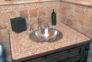
For another residence -- in Tenafly, NJ -- Fanelli designed a kitchen with a combination of natural stone and tile to create a textural effect. The backsplash of the kitchen countertop was done with a handcast custom mosaic paisley trim and pillowed cross-cut travertine stone as its field material.
"I liked the texture of the glazed look with natural stone," said Fanelli. "It worked well in the ambience of the room and with the color of the cabinetry."
Practical and fun
The Cardservice International building in Moorpark, CA -- built in the 1980s -- needed an update. The stone selected to contemporize the exterior of the building was gray slate, also used on the interior with black and cream marbles.For the servery, including a pizza oven, floor and main corridors, the designers of Stewart, Romberger and Associates in Los Angeles, CA, wanted to tie the color scheme of the building in and create and interesting and fun dining experience for the building's employees. When it was discovered by the designers that the tiles used on the walls in the servery wouldn't fit around the pizza oven, mosaics became a perfect option.
"It all started because the client wanted to install a round pizza oven in the space," said Mary Kay Shaefer, senior project interior designer at Stewart, Romberger and Associates."The diameter of the oven was too tight to use the 4- x 4-inch tiles we were using on the walls in the servery, so we came up with idea to use mosaics of the same tiles. We also thought the use of mosaics would highlight the pizza oven."
On the pizza oven, six different colors of Buchtal Chroma tile were used, including Glossy Black, Light Sahara, Distinct Lilac, Intense Carmine, Medium Green and Light Gray. "The color palette was chosen to coordinate with the overall color schemes of the Cardservice International Offices," said Shaeffer.
The use of mosaics on the floor came about to fit maintenance needs. The biggest challenge, according to Shaeffer, was to find a non-slip floor tile that would match some of the Buchtal colors that had already been purchased, when they decided to switch from colored concrete flooring materials to the mosaics.
"Originally the floor was supposed to be stained concrete," said Shaeffer. "However, we had used that material in the restrooms of the Cardservices International office and it proved to be a maintenance problem for them, so the client requested that we change it to something else."
On the floor, Quarry Tile Co.'s Natural Hues of Strawberry and Grape were used along with four colors of Ceramica Vogue Interni, including Ivoria, Grigio, Nero, Pearl and Buchtal Chroma Medium Green.
"Providing mosaic everywhere would have been too expensive, so we designed a pattern of mosaic circles laid within standard square tiles that were placed in the servery and the main corridors," she said. "For the remainder of the floor areas, we sealed the existing concrete slab. As far as I know, everyone likes it and the pizza oven has been a big hit."

Displaying new art
The Union League Club of Chicago is a forum for people of influence to gather and discuss political, governmental, economic and social issues, while providing guestrooms, dining and health club services to its members. The club is also home to the one of the nation's largest held art collections, including paintings, sculpture and antiques.For the new women's spa area recently added, Club Manager Jonathan McCabe wanted to continue the extensive art collection with something more unique. He asked Evan Glassman of Studio E in Chicago to create a wall mosaic based on a painting already found in the facility. Entitled "In the Surf," the painting -- originally done by artist Edward Harry Potthast -- is a colorful, impressionistic depiction of a woman and two children in the ocean.
"They built the spa at the club for women in an attempt to get more women to join," said Glassman. "This painting was selected based on that."
Glassman's first step was to sketch the 30- x 50-inch painting. He then chose the colors to be used in the mosaic. "We used scrap stained glass to select the colors," he said. "We wanted to mimic the painting by using the same impressionistic effect in the mosaic, so we scattered a lot of color. We used six or seven hues of blues. Red, violets, purples, pinks and yellows were also important."
Four artisans from Studio E, including Glassman, put the 115-square-foot mosaic together over a four-week period. They utilized Bisazza 3/8- x 3/8-inch and 3/4- x 3/4-inch Venetian glass and stained glass, in various shapes and sizes. For the border, stained glass was cut into 4- x 4-inch pieces to complement the stained glass in the mural. They used Venetian glass because it was cost-efficient, according to the artisan.
"The main focus of the mosaic was the characters in the painting -- the mother and the two children," said Glassman. "We worked on those extensively and then on the waves."
Once the mosaic was finished, the artisans also installed it onto the spa wall. "It went behind the Jacuzzi," said Glassman. "We front-taped it to three different panels, then levered it up to the wall with thin-set installation. The people at the spa love it. Many people are enjoying seeing one of the club's paintings brought to life in another medium."
Once the work was completed and installed, the client commended Glassman on the mosaic. In a letter of thanks written to Glassman, manager Jonathan McCabe stated: "You have faithfully recreated a treasured work of art out of the Union League Club's art collection and made it a full wall treasure for the women members to enjoy as they partake in the Club's spa facilities."
Matching client desire
When the owner of a house in Newport, RI, wanted a mosaic of an osprey for the foyer of his 14,000-square-foot estate, James Nuzzo of Nuzzo-Campion Stone in Lincoln, RI, knew how to make his desire a reality."The owner of the house has an affinity for ospreys," said Nuzzo. "He sent us a black-and-white photo sample of what he wanted. I did some research and found a photo on the Internet of an osprey and sent it to Akdo Intertrade [of Bridgeport, CT]."
The mosaic was done as a collaboration of architects at Newport Collaborative of Newport, RI, Akdo Intertrade and Nuzzo-Campion Stone, who fabricated and manufactured the mosaic. Nuzzo had a key part of the process, as he not only selected the picture, but also the colors for the mosaic.
"Akdo sent as many mosaic tiles as possible," said Nuzzo. "Our goal was to match the colors with the photograph and make it look realistic." After going back and forth on the color selection with the architect and owner, he selected 15 colors for use in the mosaic, all hues of browns, tans, blues and grays.
"The biggest challenge was working with materials that were specific in color," said Nuzzo. "It needed to look like an osprey, not a graphic representation of one. Akdo's people hit the colors just right, and when they put the mosaic together, the colors were put together perfectly."
The mosaic, 5 feet in diameter, was made up with 1/2- x 1/2-inch, 3/8- x 3/8-inch and 1/4- x 3/8-inch tiles of marble and limestone. All together, about 30 square feet of material was used for the osprey mosaic. The material varied in honed, tumbled or polished, depending on what areas of the mosaic it was used on.
"We worked with stone that had the colors and markings of the osprey, and we had to also mimic the softer sections, like the down sections of the bird," said Nuzzo. "We used tumbled marble for those sections. The field stone was polished marble and some stone was honed, but the majority of it was tumbled."
The color palette of the background of the osprey was chosen as deliberately as the color of the bird itself. "Originally, the owner wanted blue as the background, but we couldn't find an intensity of blue that didn't compete with the osprey," said Nuzzo. "The rest of the floor was limestone, so we recommended that the whole thing be neutral."
"There was a challenge in marrying materials to textures, and the softness and hard lines of the bird," he added. "But we did it and it came out beautifully."
An enhancing backdrop
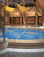
When Tim Guitterez of Pyramid Development designed his own home in Honolulu, HI, mosaics were a critical element of the design. Multi-colored mosaics were included throughout the interior of the residence, as they were used in several of the bathrooms on the floors as well as the vertical surfaces.And while mosaics are a major component of the design, the builder also wanted a field tile that would present an upscale image, while also not distracting from the beauty of the mosaics. To accomplish this design goal, he selected Durango Especial Stone [TM], which was quarried in Mexico and supplied by World Wide Stone Corp. of Scottsdale, AZ. The builder felt that the stone had the aesthetics to create visual interest, while at the same time allowing the mosaics to be thoroughly experienced.
A total of about 4,000 square feet of Durango Especial Stone was used in the residence, primarily in tile form, but also in smaller units for borders around the showers, tubs and other areas. The mosaics were also used in a range of applications, such as a circular mosaic medallion at the center of the bathroom floor as well as in smaller modules for the shower interiors.
"Ribbon" mosaics
Also used extensively were the mosaic patterns for a private residence designed by Maya Polaski. For this home, the design specified the mosaics in a flowing ribbon pattern, which can be found throughout the residence in varying shades of color.At the entry foyer, the main field is comprised of mosaic pieces in an off-white tone, and the ribbon mosaics are used around the perimeter of the space. Two different shades of stone -- including shades light gray and a rust color -- were used for the form the "ribbon" patterns, which billow towards the center of the room. Meanwhile, furnishings such as the light fixtures and railing of the main staircase were designed to mirror the movement of the mosaic patterns.
This dramatic patterning of mosaics can also be found in the bathrooms. In these spaces, the ribbon patterns were not only used for the floors, but also for the vertical surfaces, such as the shower stall. Mosaics were used for both the exterior and the interior of the shower stall, with the same bone-colored mosaic pieces for the field and light gray pieces for the ribbon patterning, which frames the shower door.
On the bathroom floor, a field of bone-colored mosaic tiles is accented by ribbon mosaic patterns and borders in shades of gray, which highlight feature areas of the room, such as the sink and tub, both of which have an antique design.
In the kitchen area, the use of mosaics continues, but in a more subdued pattern. The floors are once again comprised mainly of bone-colored mosaic pieces, with a thin pattern of mosaics surrounding the borders and the center island.
Throughout the residence, the furnishings and fixtures were carefully chosen to enhance the classical design theme. And with the mosaics running throughout the home in different formats, the overall design goal was successfully achieved.
Looking for a reprint of this article?
From high-res PDFs to custom plaques, order your copy today!


