
From
bold and dramatic to simple and subtle, stone and tile have the ability to set
the mood of an interior space. For this condominium in Telluride, CO, local
stone was used for fireplaces and accent walls throughout the home - creating a
“soft mountain contemporary” feel. Homeowners: Bill and Katrine Formby, Austin,
TX; General Contractor: Hopgood Building Co., Telluride, CO; Architect: L.
Taylor Lohr Architect, Portland, OR; Interior Designer: Klm Interiors, Austin,
TX
Photo © 2008 Thomas McConnell/courtesy of Through the Lens Mgt.
Photo © 2008 Thomas McConnell/courtesy of Through the Lens Mgt.
While it remains critical for interior designs to meet practical demands, the limitless options offered today in stone and tile collections also allow these spaces to express personality. From chic and sophisticated to cool and casual, today’s interior spaces are representing the characteristics and mood of their occupants - and a palette of stone and tile is a key component to obtaining each unique design.
Using stone and tile is no longer just about material selection. While choosing the appropriate stone for a countertop or deciding between porcelain or glass tile for a kitchen backsplash can affect the tone of a room, there are many other options to consider nowadays. Textures are playing a large role in product development today. In addition to polished and honed surfaces, there are so many other finishes offered. Tiles are now being manufactured with surfaces that replicate the feel of textiles as well as natural materials such as wood and stone. A smooth glossy porcelain tile or iridescent glass mosaic can bring a feeling of modern elegance, while rough-cut pieces of limestone or slate can conjure a warm rustic environment.
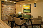
After
reviewing numerous mock-ups, the homeowners - with the help of their builder -
found the perfect blend of Kensington Stone and a locally quarried material
called Telluride Gold to build the accent walls and fireplaces in both their
new condominium and penthouse. Complementing the stone wall in the dining area
of the condominium, a floor pattern incorporates Sebastian flagstone and Walnut
wood planking. Stone Suppliers: Robinson Brick Co., Denver, CO (Kensington
Stone); Telluride Stone Co., Telluride, CO (Telluride Gold); Aplin Masonry,
Telluride, CO
Photo © 2008 Thomas McConnell/courtesy of Through the Lens Mgt.
Photo © 2008 Thomas McConnell/courtesy of Through the Lens Mgt.
Soft mountain contemporary
This was the case for a couple rooted in Austin, TX, who recently devoted much of their time and energy to building their dream vacation home in the scenic town of Telluride, CO. Originally a mining community at the turn of the century, the mountain town of Telluride, which sits among 14,000-foot peaks at the base of the Telluride ski area, has become known for its luxurious resorts and features a National Historic Landmark District with Victorian-era architecture. As a result, the homeowners had to be mindful of the building’s historic surroundings while at the same time developing their own signature look for their home’s interior with a rich palette of stone and tile.

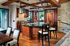
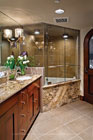
In
the kitchen of the condominium, a Jet Black granite countertop with a thickness
of 3 cm is paired with a backsplash of 6- x 12-inch Lake Garda Driftwood Gloss
glass tiles that are horizontally stacked. Stone Supplier: Cactus Stone &
Tile, Phoenix, AZ; Tile Supplier: Ann Sacks, Dallas,TX
Photo © 2008 Thomas McConnell/courtesy of Through the Lens Mgt.
Photo © 2008 Thomas McConnell/courtesy of Through the Lens Mgt.
While the first level of the building is a commercial space that is not owned by the Formbys, the couple does own the upper levels of the structure. Formby explained that the lower level of the residential space was converted into a one-bedroom condominium, and the two floors above that comprise a three-bedroom penthouse.
“We were originally going to do a ‘light’ remodel, but we ended up almost gutting the entire space,” said Formby. “The interior is ‘soft mountain contemporary.’ The mountains are very majestic in Telluride. We wanted the materials to take a backseat to the scenery.”

The
stone used for the interior walls and fireplaces in both residential spaces is
a thin veneer - ranging from 1 ¾ to 2 ¾ inches in thickness. The stone walls
are grouted with a custom color mortar to create an aged appearance, while the
mortar joints for the fireplaces are recessed - presenting a dry-stacked look.
Photo © 2008 Thomas McConnell/courtesy of Through the Lens Mgt.
Photo © 2008 Thomas McConnell/courtesy of Through the Lens Mgt.
The Formbys worked closely with Todd Hopgood of Hopgood Building Co. in Telluride to choose just the right combination of stone for the walls and fireplaces. “A lot of mock stone samples were done - different stones, different patterns and different grouts - and then more samples were done,” said Formby. “We wanted it to look old, and we wanted it to look natural. Our builder, Todd Hopgood, came up with the magic formula.”
Hopgood explained that a combination of stone was used to achieve the look that his clients desired. “The majority of the stone was Kensington Stone from Robinson Brick Co. in Denver,” he said. “We blended that with a locally quarried stone called Telluride Gold to get the color contrast. It was quarried just outside of Telluride by the Telluride Stone Co. It is a pretty common material that is used to maintain continuity - especially in the Mountain Village, which is the small village above Telluride.”
The
stone pieces used for the walls in the penthouse as well as the condominium
were given a light mortar wash over the face of the stone to achieve the
desired aesthetic.
Photo © 2008 Thomas McConnell/courtesy of Through the Lens Mgt.
Photo © 2008 Thomas McConnell/courtesy of Through the Lens Mgt.
The stone walls are grouted with a custom color mortar. The Formbys wanted the stone pieces to have an aged appearance. “Originally, I was given some [pictures] of old European homes to get me in the ballpark,” said Hopgood. “Older techniques are just a little different than what we do now. We put a light mortar wash over the face of the stone [to get the desired effect.]”
For the fireplaces, the mortar joints are recessed - presenting a dry-stacked look. “The mortar joints are recessed so that architecturally it stands out,” said Hopgood.
The
kitchen in the penthouse also features a Jet Black granite countertop and Lake
Garda Driftwood Gloss glass tiles for the backsplash, although the glass tiles
are in 12- x 12-inch format. Stone Supplier: Cactus Stone & Tile, Phoenix,
AZ; Tile Supplier: Ann Sacks, Dallas, TX
Photo © 2008 Thomas McConnell/courtesy of Through the Lens Mgt.
Photo © 2008 Thomas McConnell/courtesy of Through the Lens Mgt.
Walnut flooring was carried into the kitchen of the condominium and subtly accented by a Jet Black granite countertop with a thickness of 3 cm - supplied by Cactus Stone & Tile of Phoenix, AZ. “I started out wanting this fantastic granite that was bright red and green,” said Formby. “I thought, ‘This is absolutely gorgeous.’ Then I thought more about it and decided that it was too dominant and we needed to tone it down. The more I worked on the spaces; I realized that people that go to Colorado want to rest. So, I wanted my eyes to rest, and the restfulness of the black [granite] convinced me.”
The 6- x 12-inch Lake Garda Driftwood Gloss glass tiles by Ann Sacks Tile & Stone, which were selected for the kitchen backsplash by Dawne Stewart of Signature Floors and More in Corsicana, TX, also create a soothing look. The tiles were horizontally stacked. “I have gotten so many compliments on them,” said Formby. “They have a beautiful natural clean color that is harmonious with the stone.” The same palette was reproduced in the penthouse kitchen, although 12- x 12-inch glass tiles were used for the backsplash.
The
stone walls help to maintain a rustic elegance throughout the two-story
penthouse.
Photo © 2008 Thomas McConnell/courtesy of Through the Lens Mgt.
Photo © 2008 Thomas McConnell/courtesy of Through the Lens Mgt.
A point of interest in the space is a two-sided fireplace that also is seen from the master bedroom. The base of the fireplace as well as a portion of the surround layer is formed with 9/16-inch Linen mosaic straight marble tile from Ann Sacks. The top of the surround is comprised of 5/8- x 8-inch Linen marble pencil liners and the top of the base is the same Black River granite employed for the vanity top.
For a second master bath in the penthouse, the homeowners opted to have the vanity top and the face of the tub surround fabricated from Juparano Persa granite, which was also supplied by Cactus Stone & Tile. Lake Garda Hemp gloss 12- x 12-inch glass tiles were employed for the shower walls. The neutral shade of the tile is a nice balance to the wild veining found in the granite. Additionally, 12- x 24-inch tiles in the color “Bark” from Ann Sacks’ Summit Line was chosen for the floor. “We used larger pieces because they are more contemporary,” said Formby.
Design and construction of the Telluride condominium and penthouse took approximately two and a half years to complete. Installation of the stone walls and fireplaces was finished in about seven weeks, according to the builder.

One
of two master baths in the penthouse includes a floor of 12- x 24-inch
Cappadocia White Linen tiles and a vanity top made of Black River granite.
Additionally, a point of interest in the space is a two-sided fireplace that
also is seen from the master bedroom. The base of the fireplace as well as a
portion of the surround layer is formed with 9/16-inch Linen mosaic straight
marble tile. The top of the surround is comprised of 5/8- x 8-inch Linen marble
pencil liners and the top of the base is the same Black
River granite employed for the vanity top. Stone Supplier: Cactus
Stone & Tile, Phoenix, AZ; Tile Supplier: Ann Sacks, Dallas,
TX
Photo © 2008 Thomas McConnell/courtesy of Through the Lens Mgt.
Photo © 2008 Thomas McConnell/courtesy of Through the Lens Mgt.
Hopgood said there were five stonemasons on the jobsite. “This was simply because we had to go up several flights of stairs,” he said. “We had some guys mixing and remixing mortar, some hauling stone up the stairs and some putting the stone on the walls.”
According to Formby, she and her husband are very pleased with the final result of the renovation. “Once we decided on the stone, there was no problem,” she said. “It all went beautifully. One thing I was surprised at is that the sunlight from the mountains gives a little green cast [on the stone]. When we put the stone against our wall in our Austin home it looked beige, and then when we put it on the wall in Colorado it looked a different color. We really had to look at it in the light to make sure that it looked right.”
While the Formbys spend a couple of weeks at their new vacation home - dubbed “The Heart of Telluride” - in the winter to ski and also a couple of weeks there in the summer, they rent the spaces out the other time during the year. “We have been fantastically thrilled with the response,” she said.
Urban sophistication
In contrast to the warm rustic feel of the mountains, stone and tile were used to bring a cool clean look to a residential high-rise in Miami, FL. Not far from the luxury oceanfront homes that line the beaches of Miami is Brickell Avenue - an up and coming hotspot for young professionals. And among the new residential high-rises to open on the street is 500 Brickell, which utilizes a palette of stone and tile to bring a trendy hip vibe to the building’s public spaces.
“Brickell Avenue is one of the main streets of downtown Miami,” explained designer Michael Wolk of Wolk Design Associates of Miami, FL. “It’s an area where they are hoping young professionals will live in these buildings. It’s a little lower profile than the condos on the beaches that are people’s second and third homes. It has a young urban look and feel.”
The 40-story high-rise is comprised of two towers, and its lobby features a contemporary design, with Gold quartzite used for both the walls and floor. “We wanted it to have a fresh cool urban feel,” said Wolk. “The quartzite worked in with our palette. It’s such a varied stone. It goes from pink to orange to brown. A lot of times we choose stone for its monotone characteristics. In this case, it was just the opposite.”
For
a second master bath in the penthouse, the vanity top and the face of the tub
surround are made from Juparano Persa granite. Lake Garda Hemp gloss 12- x
12-inch glass tiles were employed for the shower walls. Additionally, 12- x
24-inch tiles in the color “Bark” from Ann Sacks’ Summit Line was chosen for
the floor. Stone Supplier: Cactus Stone & Tile, Phoenix, AZ; Tile Supplier:
Ann Sacks, Dallas, TX
Photo © 2008 Thomas McConnell/courtesy of Through the Lens Mgt.
Photo © 2008 Thomas McConnell/courtesy of Through the Lens Mgt.
According to Wolk, quartzite is a challenging material to work with because it is so varied. “Fabrication requires a lot of hand selecting and sorting,” he said, adding that at the start of installation, he was on site often to supervise. “Once we set up what was acceptable, we didn’t have to be there as much.”

Among
the new residential high-rises to open on Brickell Avenue in Miami, FL, is 500
Brickell, featuring a trendy hip lobby that is a showcase of Gold quartzite
Designer: Wolk Design Associates, Miami, FL
Bands of bright shiny colorful Ribbon Mosaics form accent walls around the bar. Additionally, glass mosaics from Vidrepur were used to create a focal point on the ceiling. The iridescent tiles form the background of a cut-out where a ceiling fan was placed. “We wanted something with a lot of sparkle and color to it,” said Wolk, when explaining why the mosaics were selected for the design.

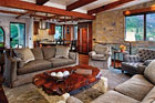
An
open airy modern environment was also created in a lounge area of the
residential high-rise with a combination of materials. Hardwood floors are
paired with colorful tile mosaics that reflect a cheery and “fun” atmosphere.
Custom contemporary
Positioned between the North and South forks of Long Island, NY, is Shelter Island - a secluded piece of land that spans about 8,000 acres, with a good portion being protected wetlands nature preserve marshland. Nearly a third of the island is owned by The Nature Conservancy, and the rest of the land makes for peaceful surroundings for private residents. Recently, a home was constructed on the shore overlooking Greenport Harbor, and Spanish tile was utilized to create a unique focal point in the kitchen that captures the homeowner’s love for the sea.
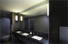
The
public restrooms of 500 Brickell feature a sleek modern design with
dark-colored stone and tile mosaics.
According to Piccione, incorporating a tile map into the design of one of his projects is something that he had longed to do. “The idea came from a trip that I took many years ago to Portugal,” explained the architect. “I went to this amazing monastery. These were very rich monasteries. They are magnificent moments in the history of Portugal.”

The
focal point of a kitchen in a home on Shelter
Island, NY, is a
nautical map made from custom-made Spanish tile, which is a tribute to the
homeowner’s love for the sea. Architect: Russell Piccione, New York, NY; Tile
Supplier/Map Designer: Chelsea Arts Tile + Stone, New York, NY; Tile
Manufacturer: Ceramica Decorativa, Spain; Tile Painter/Printer: Tile Guild, Los
Angeles, CA; Tile Installer: Brian Italiano, Brooklyn, NY
Photo courtesy of Chelsea Arts Tile + Stone
Photo courtesy of Chelsea Arts Tile + Stone
The homeowner is a world-class sailor, so the tile wall map was quite appropriate for the kitchen design, said Piccione. “We found a 19th-century map of Shelter Island,” explained the architect. “We used that for our land map, but because my client is a very serious sailor, we took contemporary navigation charts and used those for all the markings of the water. You can actually sail by consulting the map.” .com.
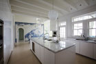
In
addition to the tile map, the clean contemporary look of the kitchen is
achieved with countertops fabricated from white marble that was quarried in
Greece along with limestone flooring.
According to Patrick, contemporary maps and satellite imagery were implemented to expand upon the map. “They wanted it to be accurate,” he said. “Not that they would literally sail from it, but they wanted to be able to look at it and roughly plan a sail. We needed to include the lower coastline of Connecticut and other areas that weren’t on the original map.

Patrick explained that he drew the map digitally over the course of months and then separated the 10- x 14-foot image into smaller panels that were more manageable.
“We used a silk screen process,” said Patrick. “The original map was copper plate engraving, and this is very close to that historical process. It was roughly plotted out using silk screen and then certain things were enhanced and others were wiped away to soften it and give an antique look. Altogether, this map was the product of 15th- and 21st-century technology.”

“We
used [a 19th-century map] for our land map, but because my client is a very
serious sailor, we took contemporary navigation charts and used those for all
the markings of the water,” said architect Russell Piccione. “You can actually
sail by consulting the map.”
Photo courtesy of Chelsea Arts Tile + Stone
Photo courtesy of Chelsea Arts Tile + Stone
Hand-molded red-body 6- x 6-inch tiles from Tile of Spain-branded manufacturer Ceramica Decorativa were selected as the “canvas” for the map. “From the beginning, I had no question what tile we were going to use,” said Patrick. “I have used Decorativa tile for years. It has a modulated surface that has a hand-molded look without being too rustic.”
According to Patrick, the architect desired the blue and white Portuguese-style look of the tiles. “If we tried it in polychrome, it would have been a very different map,” he said. “Blue and white made it more modern, in a way.” And to further enhance the contemporary design of the kitchen, white marble from Greece was chosen for the countertops and limestone was employed for the floor.
For the printing, painting and firing, Patrick relied on the expertise of artist Dennis Cafferty of Tile Guild in Los Angeles, who he has worked with in the past. “He has worked with Decorativa tile for years,” said Patrick. “One quality that he is able to achieve with that tile is an antique ‘fogginess.’”

Once
the tiles were fired, each one was marked for layout by the installer, Brian
Italiano of Brooklyn, NY. Prior to installation, the tiles were laid
out on the floor.
Photo courtesy of Chelsea Arts Tile + Stone
Photo courtesy of Chelsea Arts Tile + Stone
Once the tiles were fired, each one was marked for layout by the installer, Brian Italiano of Brooklyn, NY. “The installer I have known for years,” explained Patrick. “There were certain nuances to putting it up. You want it in the right hands.”
Prior to installation, the tiles were laid out on the floor, according to Patrick, who was on site during the installation. “I was very grateful to the architect on every level,” he said. “You don’t always have this much input over a special project like this.”
The nautical tile map was installed in the Shelter Island home in September of 2008. “I met the homeowners when I was on site for the installation,” said Patrick. “They couldn’t have been nicer. It was very satisfying - this was a unique opportunity and I was proud to be involved.”


